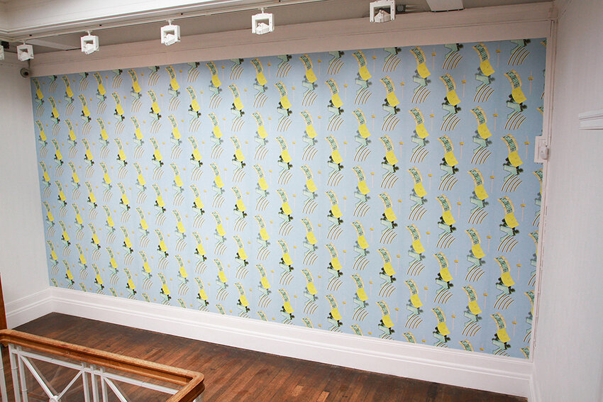
The Sea Breeze is The Cure, 2016, Digital print on wallpaper, Grundy Art Gallery, Blackpool, as part of the exhibition ‘An Architecture of Joy’
Architect of Joy
Dany Louise
An Architecture of Joy, by Jenny Steele, is an installation at the Grundy Art Gallery in Blackpool. It is situated on the upper gallery floor which is flooded with light from a dome and has a solid square bannister around the stairwell. Despite the white cube nature of the gallery, it is clearly a historical building, built in 1908.The installation consists of one entirely wallpapered wall; a cloth drape with the period wooden upper frame; a found period cabinet with painted sides; two small tapestries in period frames; and mixed media work. The gallery room perfectly complements the artwork, which is highly designed, relatively minimalist, and peppered with clues as to its provenance and meanings. These are sophisticated clues, however, which may pass a casual visitor by, possibly leaving them puzzled. There is one interpretation panel on the wall, which hints at a framework through which to look at the work but doesn't 'explain' it.
This is very much a reductionist description but I've included it to set a scene from which to consider the work and its context, and what visitors might require to understand the installation. Visitors' will approach the show individually, depending on their own interests and concerns, their backgrounds, their education, their greater or lesser familiarity with art, with architecture, with historical signifiers, with the motifs of Art Deco. Depending on these factors, their understanding of what they see is likely to be situated somewhere on a scale between complete bafflement, and comprehension and appreciation.
Unlike much contemporary art, this show doesn't reference recent popular culture (which amongst other functions also provides an easy hook for today's audiences). It is not interactive or participatory. It doesn't deploy technology and so has no 'geek factor' attractiveness. It is not fashionable; I could go so far as to say it is deeply unfashionable. In other words, it doesn't employ the obvious 'tricks of the trade'. From this perspective, it screams integrity and a certain amount of bravery. It demands a more careful consideration from the viewer because its surface is not necessarily quickly or easily understood, doesn't contain many of the most familiar signifiers of contemporary art, and therefore its content or worth is not immediately obvious.
So how does a varied public audience relate to this work? What are the ways in which the art may or may not resonate with them? What approaches could the artist and the curator employ to give visitors enough information that their response can edge towards the "comprehension" end of the scale when they look at the works and experience the installation as a whole?
Steele's show at the Grundy Art Gallery is a finely tuned installation imbued with subtlety. Its public face employs traditional materials, even though the making process uses digital methods. It's the result of ongoing research into a very particular type of architecture, and the works displayed reference a specific period of high Modernism. Steele has looked at specific 'Seaside Moderne' buildings - the Midland Hotel in Morecambe, the Rothesay Pavilion on the Isle of Bute, as well as the Blackpool Opera House, and investigated their context and meanings.
These buildings epitomise the 'Seaside Moderne', a style related to Art Deco and designed to reflect the wealth, luxury and leisure forms of ocean liners, but targeted towards the less rich landlocked populace of Britain. The intention was to feed the aspirations of holidaymakers, providing a glimpse into a more luxurious life, filled with leisure time, physical space, and smart design. But they also reflected the optimism of a new technological age and were marketed almost as a cure for modern life. Artists Eric Ravilious and Eric Gill were commissioned to decorate the interior of the Midland, Morecambe, with reliefs and friezes, repeating a style of sleek minimalist motifs that suggested movement, sophistication and modernity.
In this installation, Steele references some of these minimalist decorative motifs, along with light fittings, flagpoles, palm trees, and the colours of beach, summer sky and swimming pool. She brings together groups of motifs that are repeated in rigorous patterns to create wallpaper and curtains, paintings and embroideries. In effect, Steele is continuing the promise of the Seaside Moderne, reshaping it into forms for the twenty-first century; potentially enabling integration into our contemporary homes and life.
But how much does the work depend on at least a passing knowledge of Art Deco and Seaside Moderne? I visited the Grundy with a friend who in her own words "knows nothing about art". She liked the work without understanding it. She picked up the references to the seaside, but not to any specific architectural style; understood that the cabinet was a found object from before the second world war and liked it aesthetically, but would not have been able to place it in its historical period. She liked the paintings on it, one of which reminded her of a grandly designed theatre. But she was unable to read either the light fitting motifs or the reference to architectural "twiddles" (as I call them), thinking one was an old-fashioned desk bell and the other an ice-cream. What about the title of the show? I asked. What does that say to you? And although it is a very large clue, especially when read with the interpretation panel (which she did), it remained opaque to her.
This partial understanding didn't spoil her enjoyment of the works or show, but does illustrate the conundrum for artists and curators in displaying work that is research-led and is presented using sophisticated visual language. How much 'explaining' is required, and desirable, when presenting work to the diverse range of visitors that a public gallery will attract? I thought the interpretation panel did a good job but perhaps could have been expanded. The extra clue, that might help visitors like my friend, would have been to say, in plain language, that these works are the result of research into the Blackpool Opera House, Rothesay Pavilion, and other grand buildings, and link the particular building to the specific work.
Steele's installation is an intellectual reflection rather than a critique or questioning; an effort to pick out those elements of this optimistic grand architecture and present them to visitors in a way that will, at the least, remind them of "things that make people happy" (as my friend said it did). In this way, it absolutely succeeds. But for the visitor not steeped in art, I suspect there is a benefit in providing clearer guidance on how to read the works.
Dany Louise writes about the arts and cultural policy for The Guardian and a-n Art News. She is the author of The Interpretation Matters Handbook and has an MPhil degree researching the interface between biennials of art and public policy.